Unique and templated web design can go together
Starting with Purgatory, the largest of Mountain Capital Partners' resorts, we crafted a photography-forward and contemporary template with a casual aesthetic that confidently presented an aspirational mountain experience. This would then serve as the structure to be skinned for the sister resorts while letting each brand shine through with its individual look and feel.
An immersive transition on scroll features full bleed imagery inviting the guest into the resort experience. Quick links in the sidebar let the guest access key lodging, pass and dining options while simultaneously giving the viewport breathing room.
Purgatory’s bold colour palette paired with a modern font and minimalist icon set combine for a fresh, contemporary look.
Colour blocking allows for flexibility, with each brand applying their unique colours and patterning to the modules. Subtle patterning brings an added layer of dimension to the creative, breaking up the bolder colour blocks.
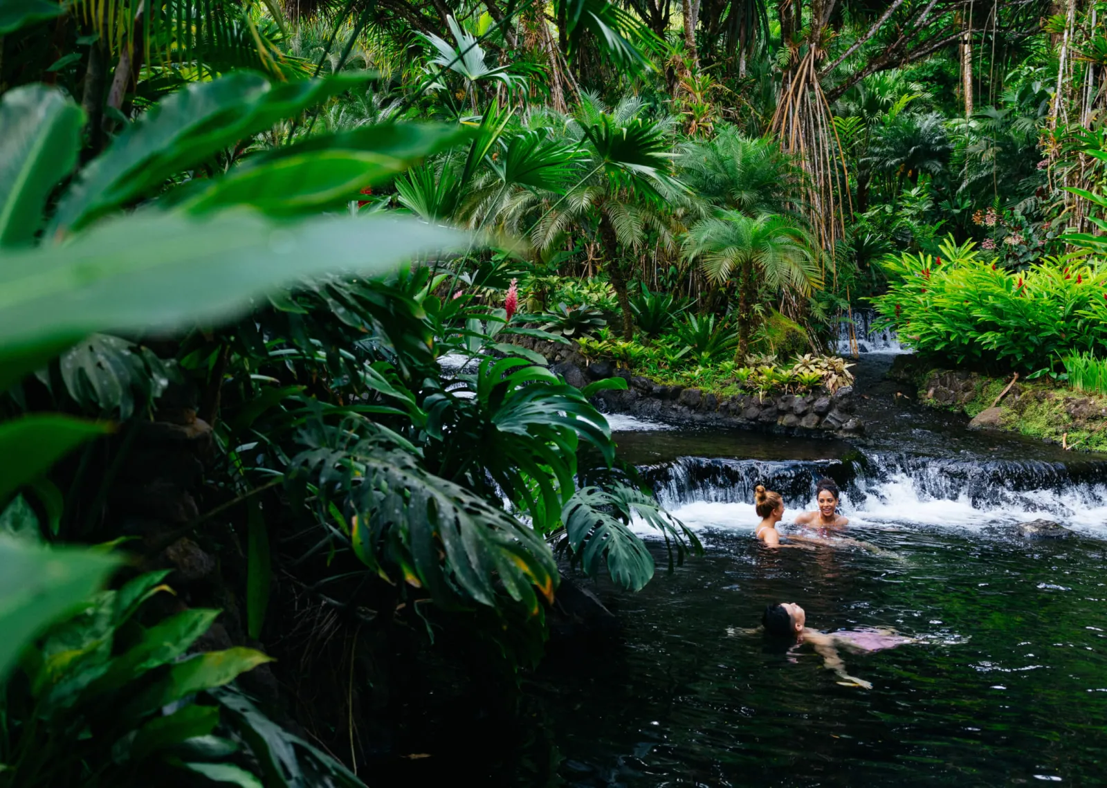
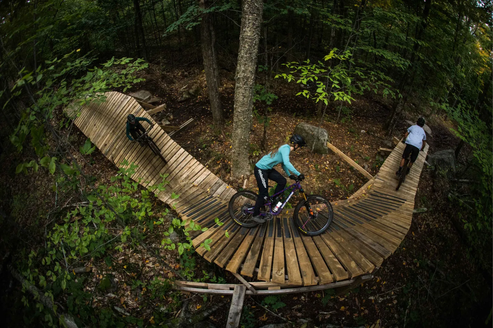
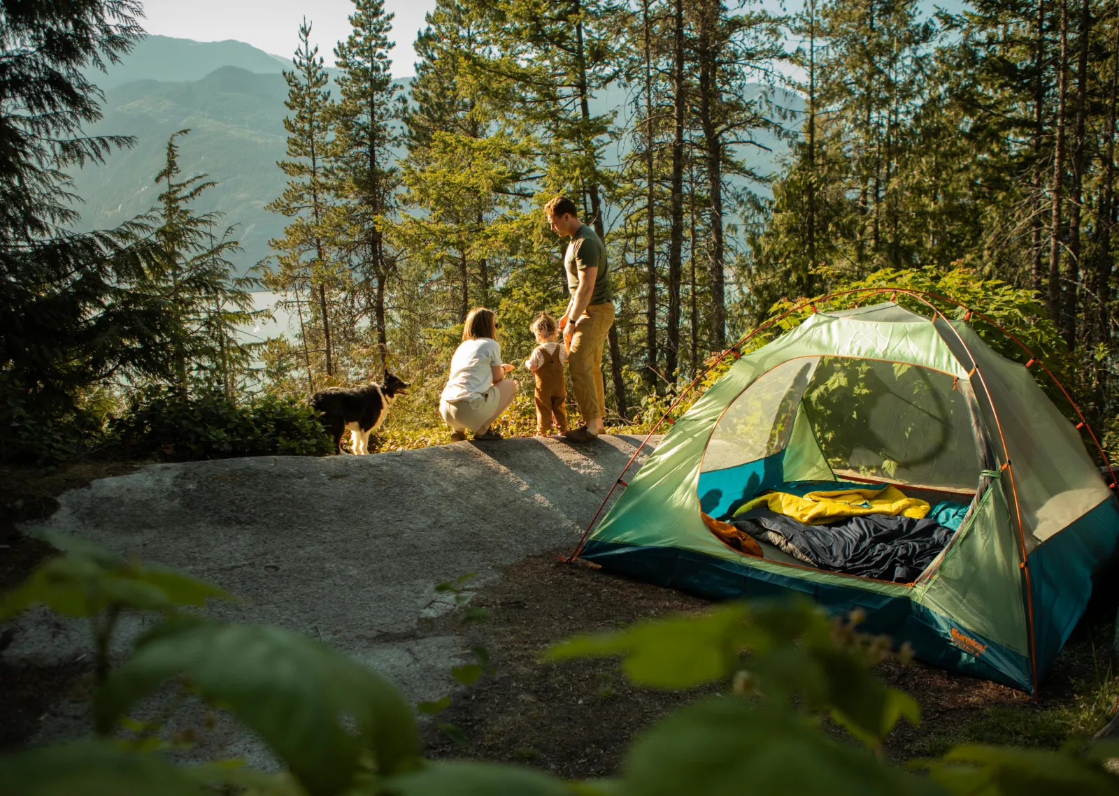
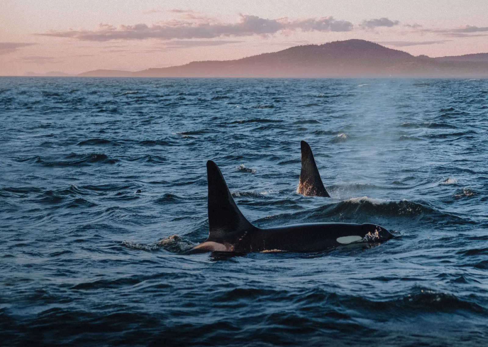
The on-mountain experience — big vistas and scenic ski action — are combined with smiling faces to bring a personal emotive touch to the site and communicate the Purgatory experience.
Functional grids and layouts facilitate clear focus on each element on the page.
After completing the Purgatory site design our hard work was done. Now we could swap colours, fonts, patterns and icons to successfully (end efficiently) roll out a cohesive suite of eight mountain resort websites, each aligning with their brand identities and displaying their unique character.


