Introducing premium ski-commerce
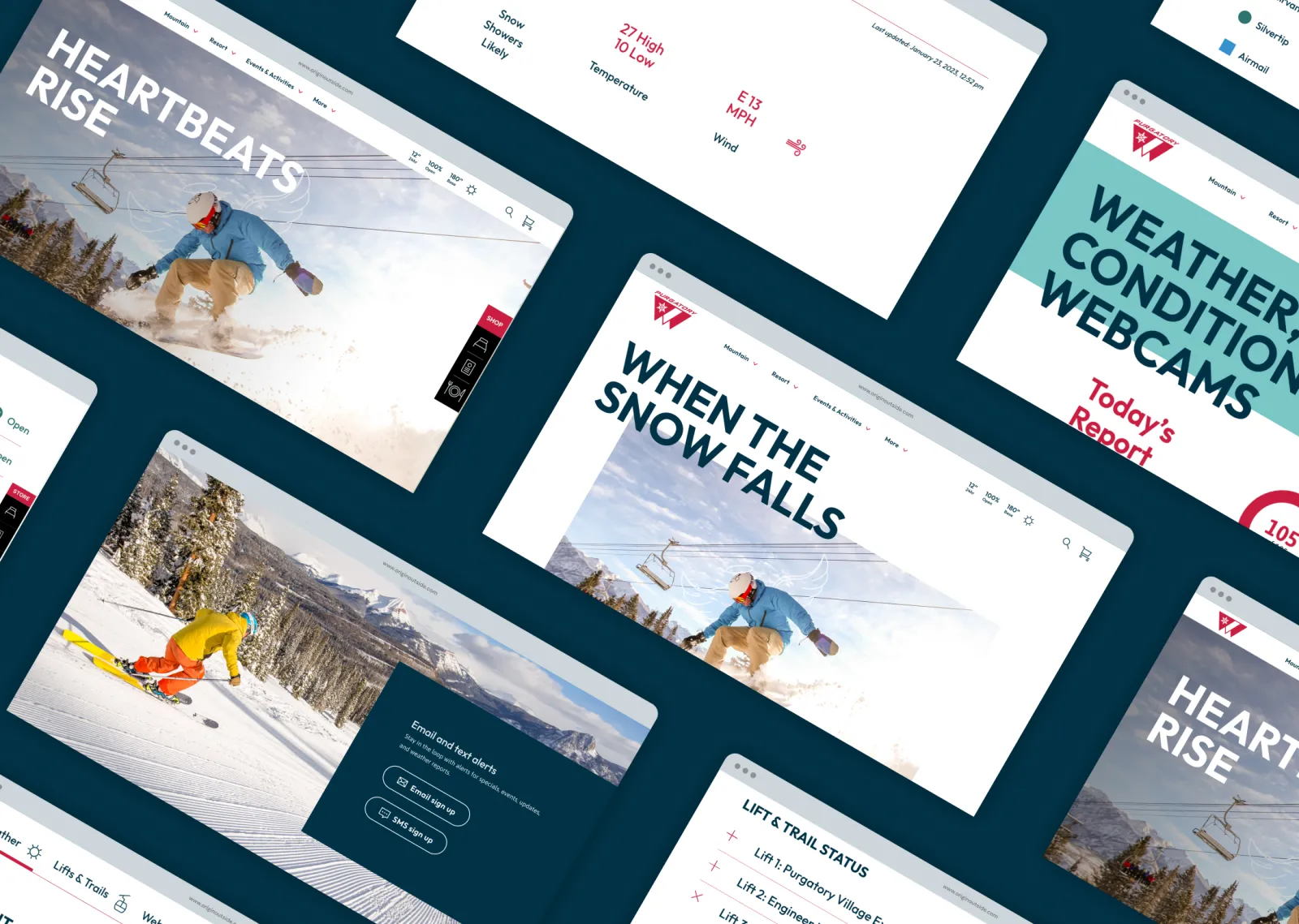
We couldn't have asked for a more exciting brief — to build an e-comm site for a ski company unlike any other. A unique, high quality, innovative experience, presented through a modern and rich aesthetic (with a hint of restrained edginess and grit), the site reflects Peak’s high-end ski craftsmanship, while simultaneously providing an integrated user experience in a custom Shopify build.
Peak’s rich, natural colour palette tones provide a fresh way to bring in a touch of Montana vibe. A lighter moss green was created to make buttons and call-to-actions pop. Mesh gradients add an organic depth to background colours — the heat mapping vibe as a nod to performance. A fully custom icon set was designed to give the site a unique touch.
Clean layouts elevate the imagery and content with a premium feel, letting the photography and products shine.
Muted colour overlays bring a unique tone to the full bleed photography differentiating it from other ski action imagery.
Peak’s white glove service is featured front and centre to help the guest select the best ski for them. Peak Skis only sells their products online, and having this personalized service offering is a key feature of their brand.
The products pop off the page through the use of light and shadow to bring a strong sense of dimension that balances the modern/flat layouts.
Rather than going straight into the standard e-comm product view, each individual ski product page starts with a unique header to bring attention to its benefits and features.
Subtle graphic elements like line work and modern gradient tones help present an innovative and technology-focused vibe.
An integrated blog brings added assurance to the brand and helps educate the guest on what’s going on at Peak.
The team at Origin is as pro as it gets. They took the time to really understand our company, listen to our needs/wants then delivered a slick, beautiful & performance-focused website on schedule despite a very aggressive timeline.


