Turn the page: looking back on 10 years of the Jay Magazine
For a full decade, we concepted, created, and produced an annual print magazine with Jay Peak Resort. Although the magazine has since been retired, it remains one of our most beloved projects in the history of Origin, and while the print medium has undoubtedly been overtaken by digital, for some brands there is still tremendous value in paper and ink. Here, we offer a retrospective journey into some of our favorite issues of the Jay magazine, insights into the process and the purpose of print, and finally, a peek behind the scenes of many late nights and shared laughs that occurred as we brought this publication to life.
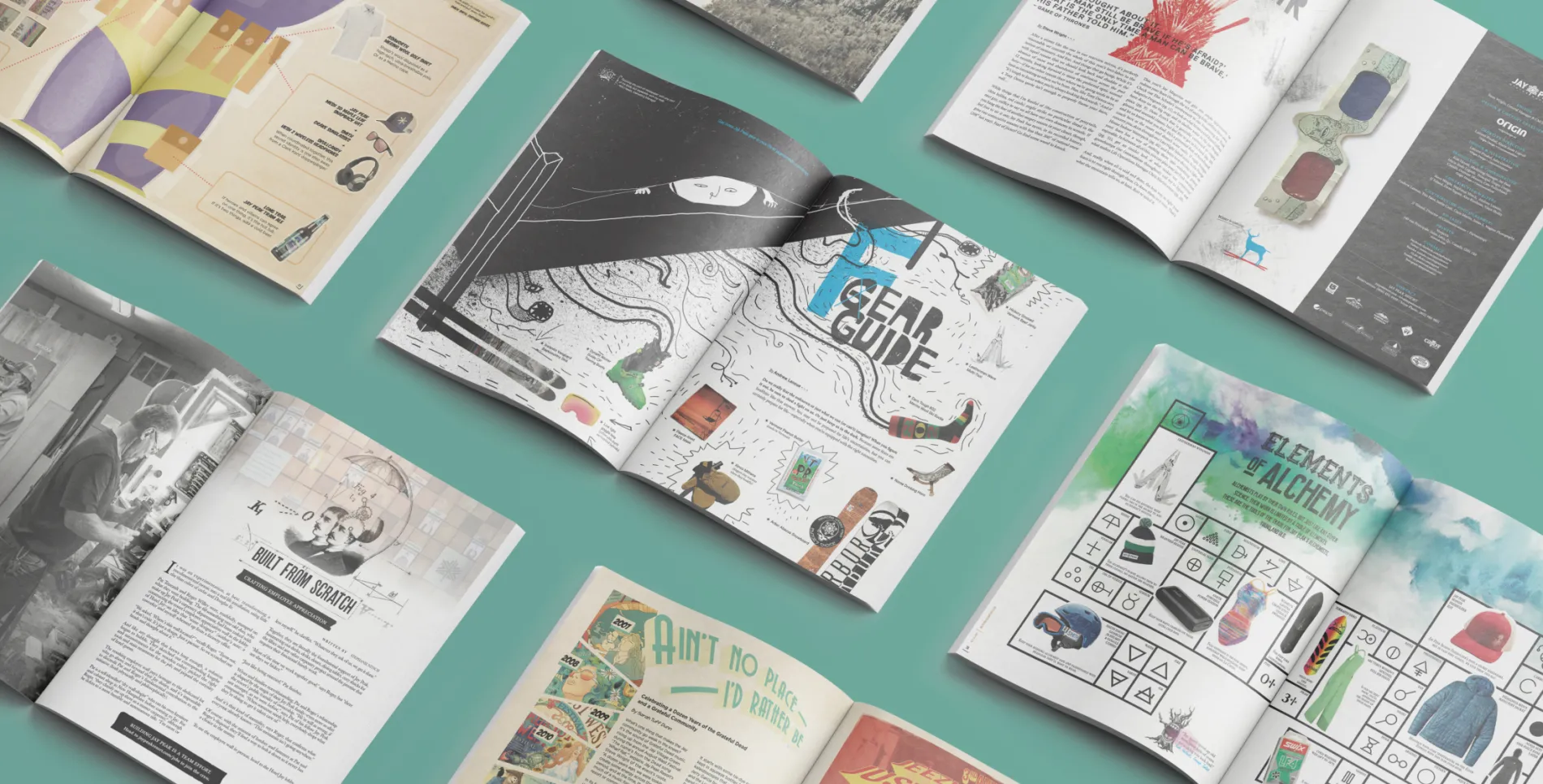
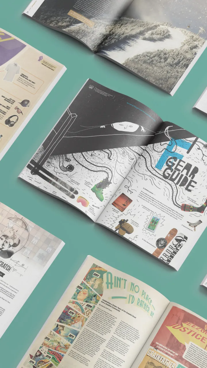
Each edition of the Jay magazine was built around a central theme that aligned with the brand and resonated with the target audience. For Summer 2016, we celebrated the people of Jay - both guests and those who work at the resort - through our Superheroes issue. Subsequent themes included Monsters (Winter 2016), Alchemy (Winter 2017), and, for the 2019 winter season - the final Jay magazine we produced - Analogue. To do this, we focused on the timeless, real life moments Jay provides its guests, with a visual direction that emphasized the candid experiences and emotions found at the resort, along with the quirks and imperfections inherent to being human.
A hugely popular regular feature of the Jay magazines was a column called “Raised Jay or Not,” which compared and contrasted the relative qualities of someone who was raised Jay versus someone who was not in a light-hearted, brand appropriate tone (ex: Bourbon bacon brittle vs. Bourbon and bacon). Another fixture of the magazine was “Go Figure,” a whimsically designed compilation of facts and figures that perfectly expressed Jay’s unique perspective.
Parting Shot appeared in the back of every issue, and while no two followed the same formula, it always expressed the Jay brand, sometimes via simple-and-surprising fun (a build-your-own monster costume), sometimes via sincere gratitude (an astrological dedication to Jay employees), and sometimes via an irreverent reader journey (a find-your-superpower flow chart).
Building a magazine makes sense for us because it gives us the space, with respect to both images and words, to tell a broader story about who we are, how we’re different, and what people can expect when they become part of our experience. As we’ve done this for several years with Origin, the process is long and involved but it’s equally logical and smooth; they are able to forecast our own particular appetites in a way that keeps it so.


