lululemon in motion
Origin was approached by lululemon’s retail team to name, develop and design the branding for a whole new experience; the lululemon mobile retail experience. This non-traditional pop up truck was meant to do more than show product. It was intended to meet guests where they are - on various campuses across the Pacific North West and to connect with those guests in unique ways.
Our first step was to define the theme for the experience and we quickly landed on the notion of movement. In the literal sense, our experience will be moving and traveling. In another sense, we’re helping our guests move. From their desks, from their routine, from their everyday lives. Our guests will ultimately be moved, maybe even transformed.
From a naming standpoint, the client chose lululemon in motion. This name invites people to an immersive, active experience. The unique name beckons you to move, alludes to the active nature of what we have in store, and places you in that experience. Lululemon in motion feels mobile, just like the program.
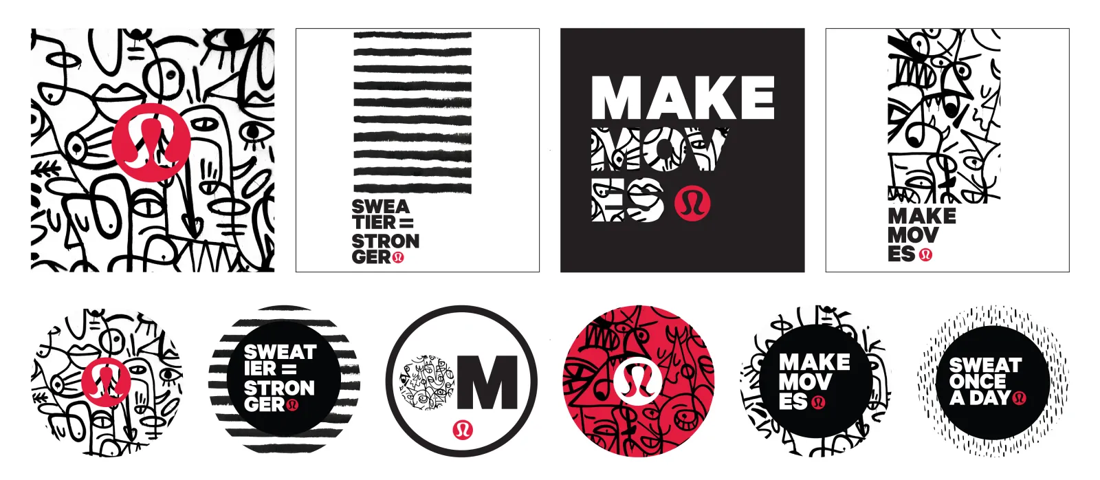
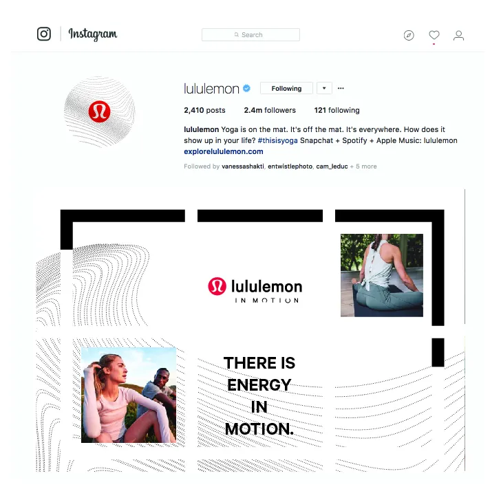
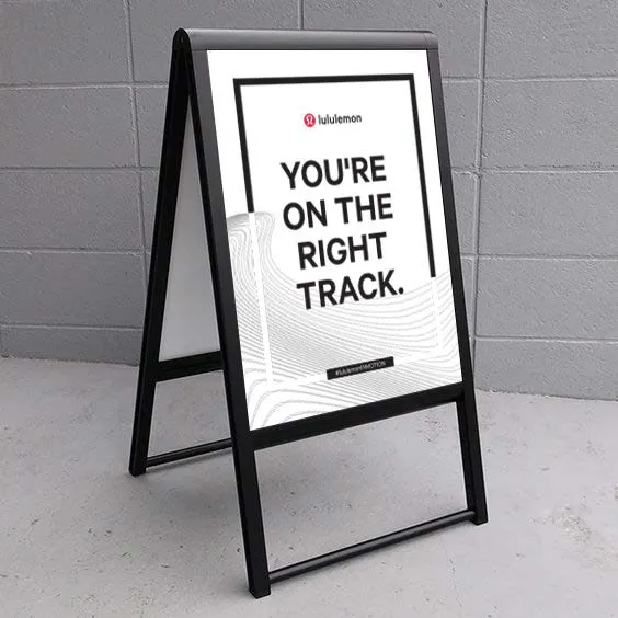
Our logo and branding elements were then developed and applied to communication tools (emails, social, printed piece) and to the physical elements like the signage, the truck itself and finally the unique product available at these experiences. A series of t-shirts and stickers were created as a way to provide guests with a limited edition souvenir of their experience.
I had the pleasure of working with Origin this year to help us brand our first mobile retail unit. The team at Origin were professional, creative, comprehensive and understood the scope of work we needed in a very short amount of time. They were thoughtful communicators and went above and beyond at every turn (and there were many turns). I appreciated their organization and ability to keep things moving, all with a big smile. Their attention to detail and thoroughness ensured we all were clear on next steps and expectations. I would absolutely recommend Origin to anyone who is looking for a talented, creative group of people. They get the job done with excellence and a sense of humor.


