Taking Taos Ski Valley off the map of ordinary
Taos Ski Valley, America’s first B Corporation ski resort, has long stood as a symbol of environmental values and community stewardship. However, as the industry became saturated with competing environmental messages, Taos needed to redefine its positioning to connect with modern travellers and stand out against the ski industry's “sea of sameness”. They turned to Origin to evolve their brand and create a winter campaign that spoke to adventure seekers without compromising their core values.
A new frontier
Over the past decade, the outdoor industry has felt the weight of "environmental fatigue," as consumers grow weary of messages urging them to "do the right thing." Fortunately, the rise of adventure travellers seeking unique, undiscovered experiences — letting them have fun without the weight of constant responsibility — allowed Taos Ski Valley to lead in this new era of ‘Fronterism.’ Together, we refined their brand platform and created a ski campaign that leveraged this insight while maintaining their commitment to sustainability.
Where big mountain meets rich culture
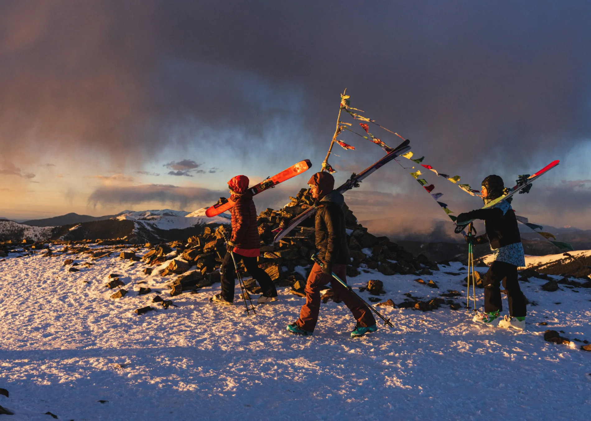
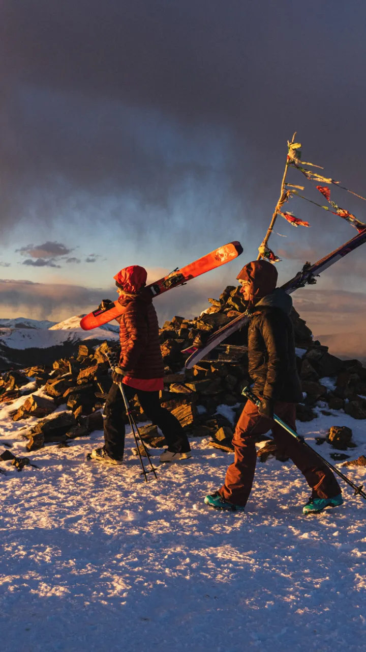
Interviews with community stakeholders, guests, and locals revealed two distinct themes that made Taos Ski Valley unlike anywhere else. As homogenization settles into the far-reaching corners of mountain culture and fresh adventures grow elusive, Taos Ski Valley was identified as a holy grail of undiscovered big mountain skiing, steeped in Northern New Mexico culture. Our strategy ensured these defining qualities were central to the brand evolution, shaping both messaging and visuals that set Taos apart.
We refreshed the brand creative to better reflect our new brand articulation and positioning by leaning in to visuals that clearly represent a big mountain experience that feels ‘out there’. An editorial-inspired design approach where overlapping images connect Taos’s steep terrain with its unique and vibrant culture lay the foundation for the brand look and feel.
A new graphic icon and an expanded colour palette drew inspiration from environmental elements that are distinct and unique to the surrounding Taos area.
Bridging the knowledge gap
As we moved from the brand evolution to winter campaign planning, we quickly recognized that misconceptions—like confusing Taos with Tahoe or underestimating New Mexico as a ski destination—were widespread. Previous marketing has over-indexed on high-funnel environmental messages or low-funnel tactical advertising, creating a gap in planning and educational content. To address this, we developed a comprehensive full-funnel winter campaign strategy. The campaign’s goal was to clarify the Taos experience, dispel myths and create a clearer path to purchase for first-time visitors.
The multi-channel campaign featured a podcast, Big Snow alerts, digital display, paid social, strategic media partnership, and a collaborative video with the Taos team’s in-house filmmaker, bringing the campaign to life.


