Reconnecting Whistler with its soul
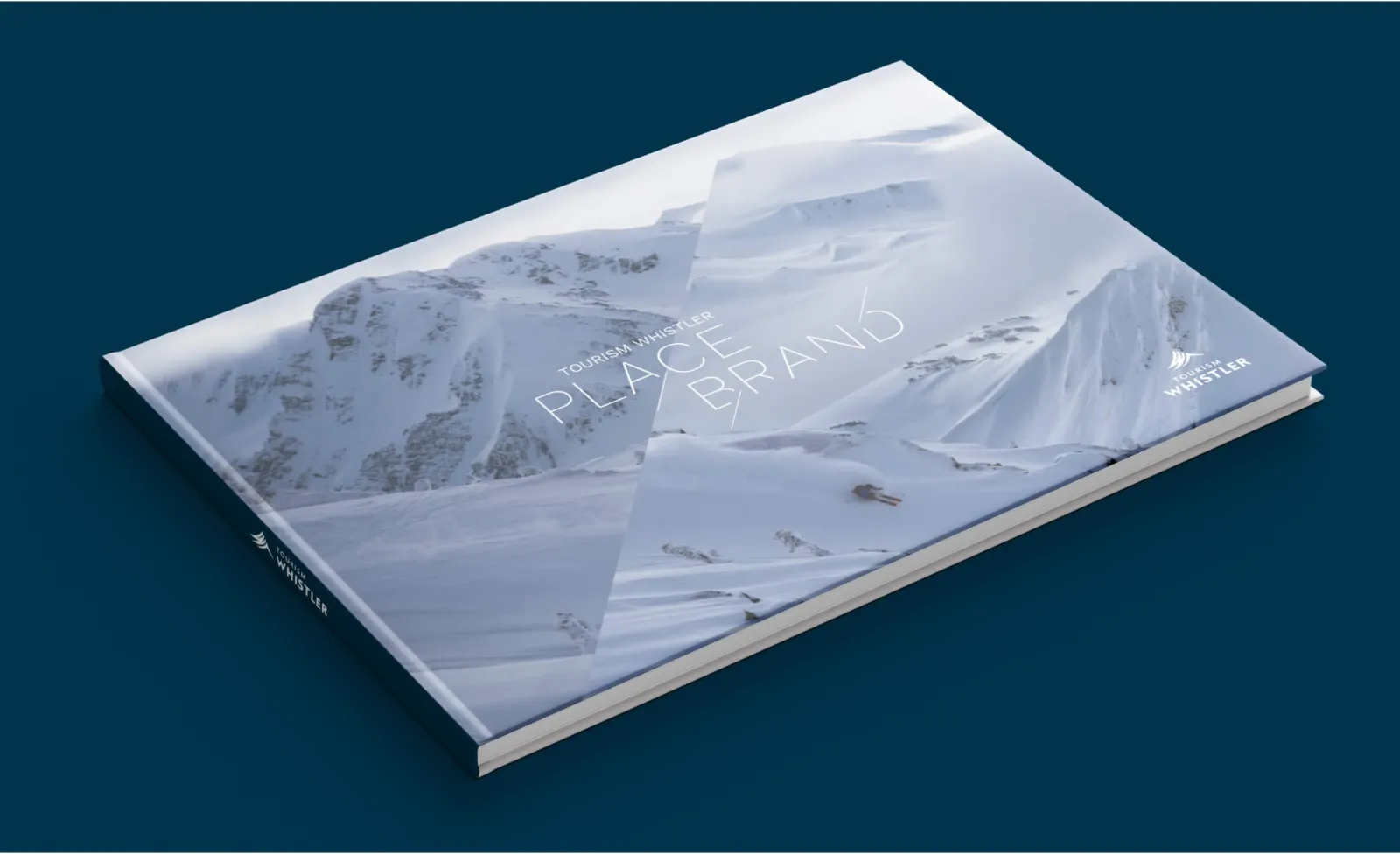
Tourism Whistler wanted a clear, long-term vision for its brand. Their goal was to unite visitors, residents and stakeholders to set the stage for responsible, sustainable tourism. Together, we looked into the hearts and minds of the community and its guests to create a new brand platform guided by a singular brand essence.
Our core focus was to distill everything Whistler stands for into a singular, enduring essence; one that is as true to the town’s heritage as it will be relevant to its future. Our search led us to a brand essence of thrill.
Visceral language and headlines deliver thrill at every brand touchpoint. Dynamic typography, refreshed colour palette and Art Direction capture Whistler’s unique energy.
The new colour palette takes a nod from the existing palette but infuses a bold amount of white and pops of brighter hues and gradients to increase visual interest. A custom typeface was created by removing pieces of the original Work Sans to present a visual effect of a skipped heartbeat or jolt, further emphasizing the essence of thrill.
A new approach to Photography was developed that ensures our imagery stays true to our brand characteristics and feels immersive, natural, warm, captivating and authentic to our majestic and awe-inspiring Pacific Northwest environment.
The team at Origin have a deep understanding of our brand and have a strong strategic ability to connect that to the needs of our customer. Working with them on a new brand platform for Whistler was a pleasure, and they found the perfect language for our brand and expressed it distinctively through the creative. It was wonderful to collaborate with them on a an important foundational piece of work to align our team, partners and community.


