The fun-loving Lake Tahoe resort undergoes a playful rebirth
Sierra-at-Tahoe is a resort in South Lake Tahoe that has play at the centre of everything they do. We were tasked with evolving their previous brand to better articulate that playful nature that is at the heart of who they are.


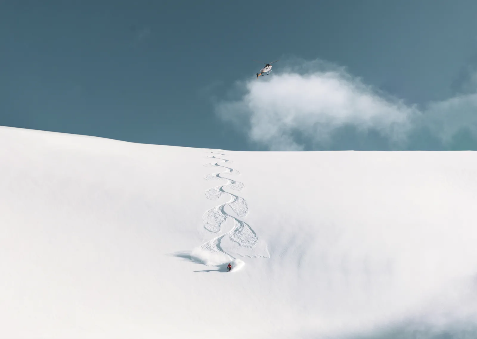
Brand creative
The creative direction came together in cool, wintery tones contrasted by a vibrant red to bring a playful energy to the overall sophisticated colour palette. For the same reasons, we chose a blocky sans serif to represent Sierra’s new brand for a bold, modern feel.


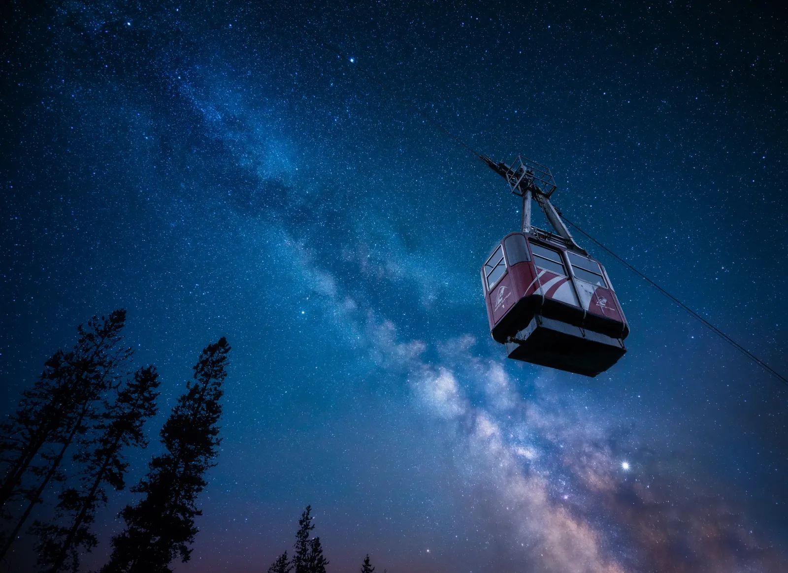
Campaign creative
The typography played a key role in bringing this campaign to life. A dynamic hand-written treatment combined with ultra candid photography adds a personal and humanized touch to the invitational messaging.


The Origin team have done an incredible job digging and guiding us to define who we are, and who we want to be. They helped us uncover our soul!